Merry Shirvani / UX Designer
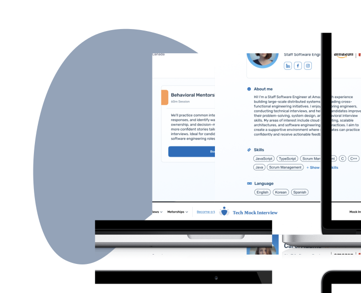
Tech Mock Interview dashboard shown across desktop and mobile devices

Tech Mock
Interview

Redesigning a Live Career Prep Platform To Expand Beyond One-Off Bookings

  • Product Scaling
  • Design Systems
  • Responsive Design
Role
UI & UX Designer
Time
May 2021 – Sep 2022
Project Type
Professional — Part-Time

/ Context

How do you prepare for your dream job interview?

TechMockInterview began as a passion project by a software engineer who had faced that pressure firsthand. The idea was simple: connect candidates anonymously with people who conduct such interviews, so they can practise before the real thing.

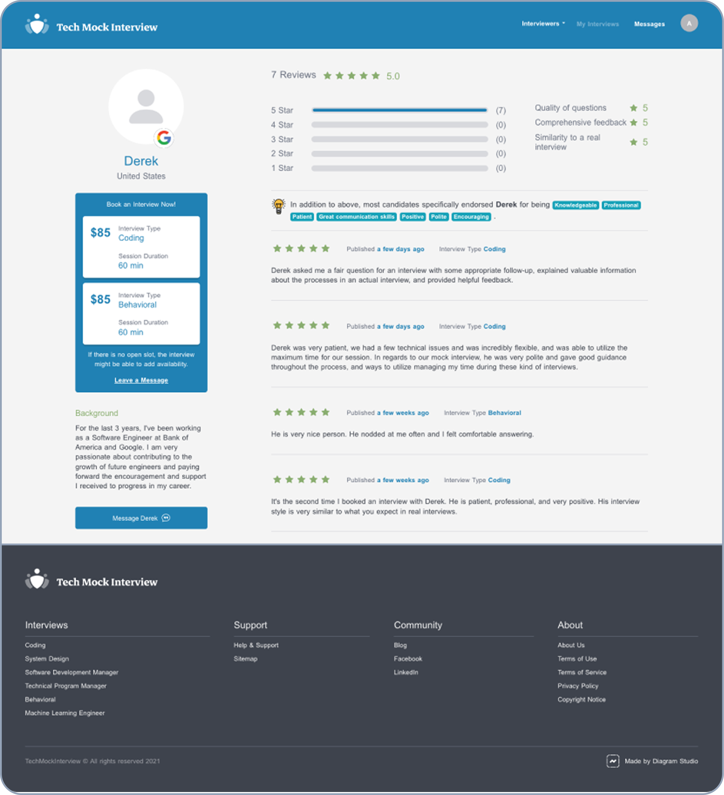
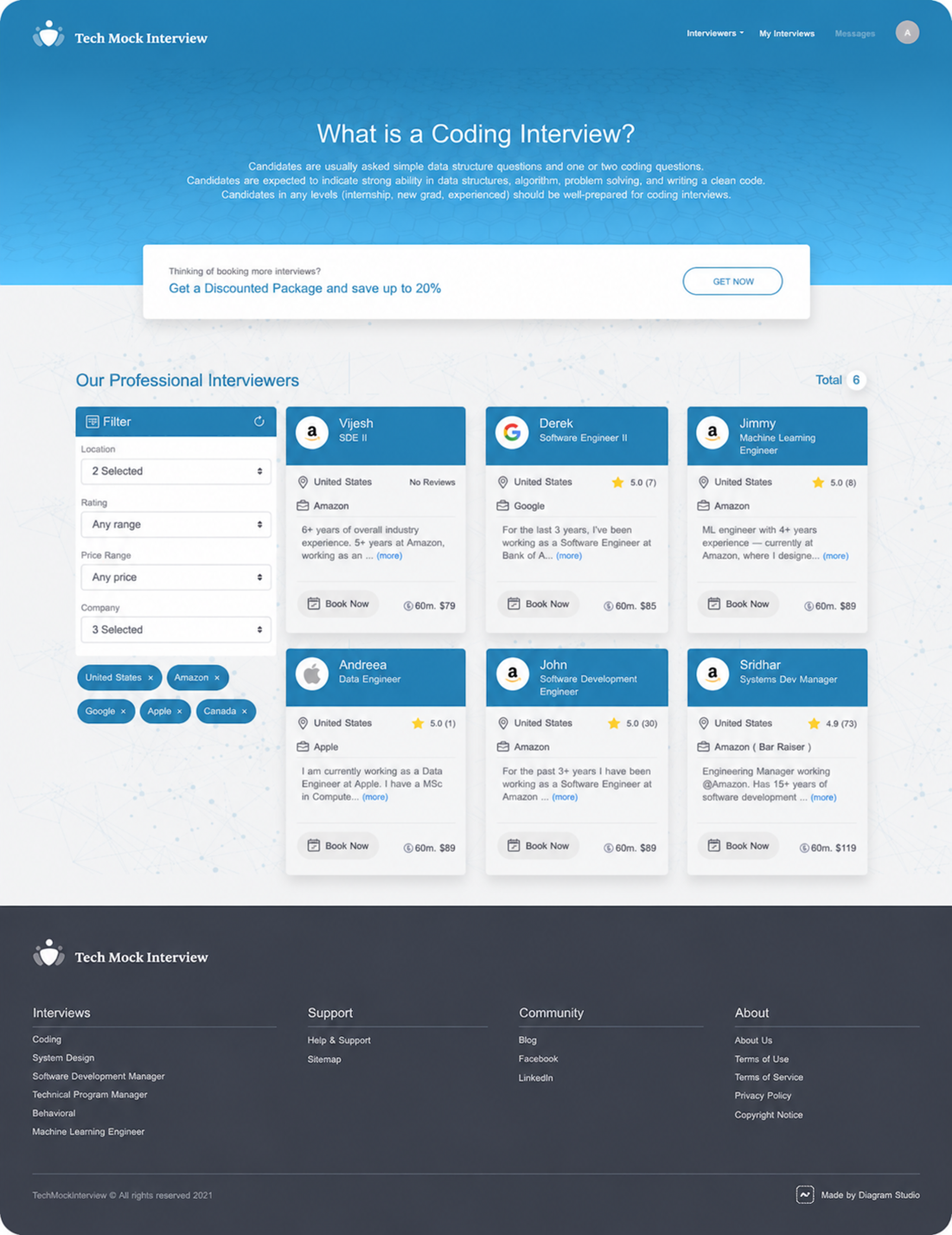
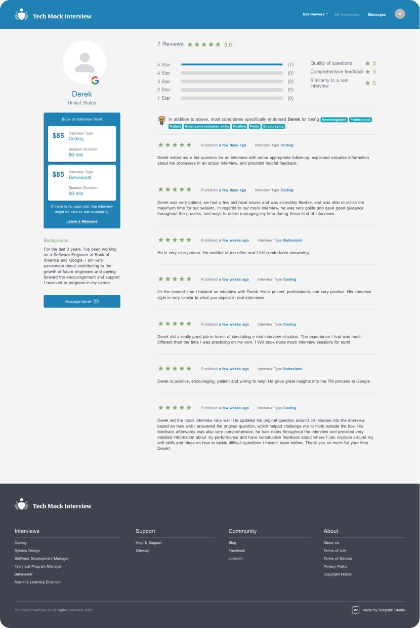
Original expert profile before the redesign
(A mock interviewer's profile on the website)

A good service deserves a matching website.

TechMockInterview had a great interviewer network, but as similar services gained traction, it couldn’t rely on the quality of its service alone. Complicated flows, heavy manual support, and weak trust signals revealed the limits of its early service model. That’s when I joined as a part-time UI/UX Designer during my first master’s degree to bring the product experience up to the quality of the service and support the team’s growth ambitions.

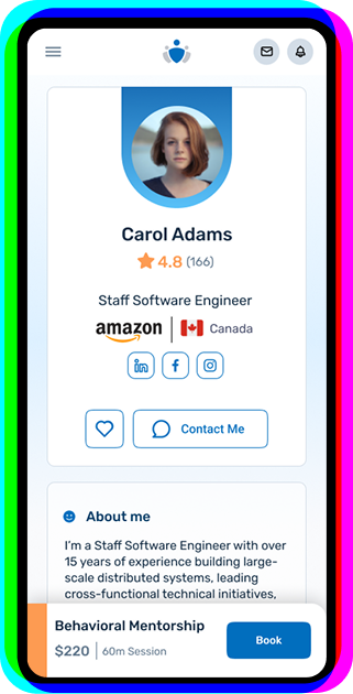
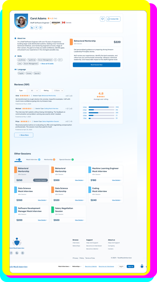
Mentor profile displayed on mobileTech Mock Interview dashboard

Mission

Improve the live candidate and expert experience with minimal disruption, building trust, reducing drop-off, and creating a scalable foundation for feature expansion.

/ The Problem & Approach

The initial brief was to refresh an outdated UI and improve the overall experience that was contributing to user dissatisfaction and high demand for manual support as users turned to email for individual support.

But the challenge was larger than a UI update.
My approach was to prioritize.

Changes had to happen within a live product, while engineering stayed focused on technical improvements. Meanwhile, the team was planning to expand into a broader career preparation service, but the product lacked the necessary foundation as it was still shaped around urgent, one-off bookings. I focused on high-impact improvements across UI and flow, while creating reusable patterns for future scalability and smoother design-to-development handoff.

  1. 1. Discover
  2. 2. Define
  3. 3. Develop
  4. 4. Deliver

/ Discover

  • Usability testing and walkthroughs
  • Feedback analysis
  • Competitor analysis

Current experience favoured experts over candidates.

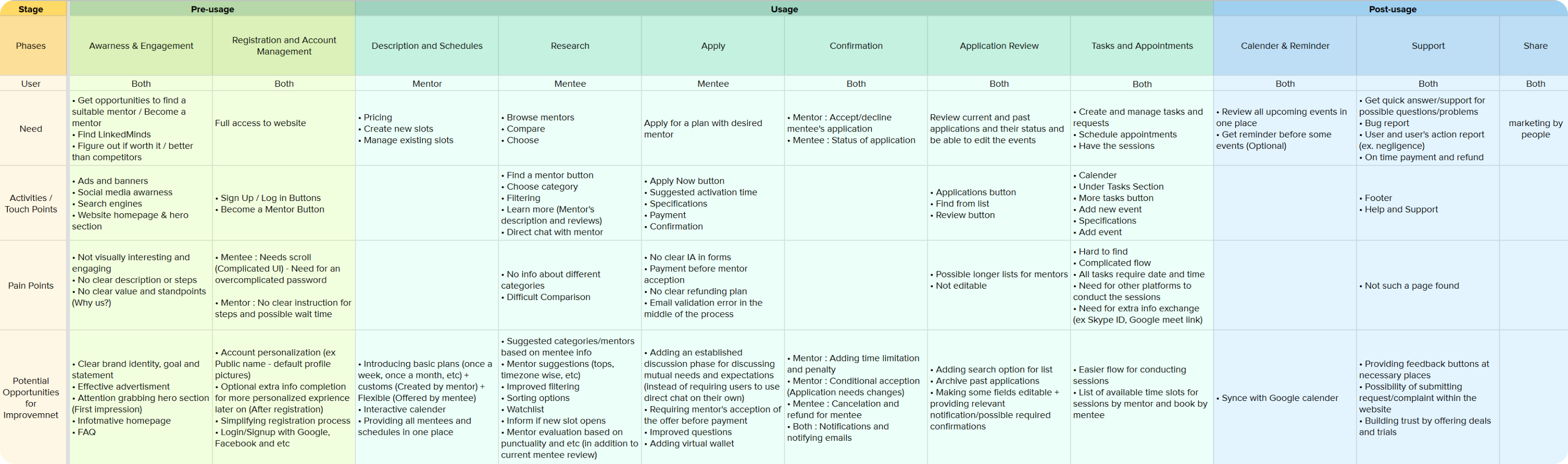
The expert network was central to the platform’s value, so most features had been built around keeping experts engaged. But compared with newer competitors, the product did not give new candidates enough clarity, confidence, or reason to start.

Booking friction was creating hidden operational work.

Unclear flows and edge-case booking scenarios led some users to either abandon the process or email the team for individual support.

Session management needed a stronger home.

Missed sessions showed that both candidates and experts needed a clearer place to track bookings, reminders, and next steps.

/ Define

I split the work into three focus areas, balancing what could improve the live product now with what would support the platform later:

Current
Experience

Refresh key UI patterns and clarify existing flows without disrupting active users, aligning the product with the quality of its service.

User
Onboarding

Help new users understand the value, navigate the website, and move into booking with less support.

Dashboard
& Scaling

Create a working space to manage sessions and future career-prep services so the product could grow beyond one-off bookings.

/ Develop

I approached this stage as an iterative cycle of exploration, validation, and alignment. Working through short design cycles with PMs, designers, and engineers, I used flow mapping, wireframes, prototypes, critiques, and feasibility reviews to test interaction logic, surface edge cases, and align on what was worth building next.

Along the way, I improved design-to-development handoff through Zeplin, more organized design files, and a refined design system—making implementation smoother and reducing ambiguity across the team.

/ Deliver

The final designs spanned three layers:

  • Refining the existing experience,
  • Strengthening the onboarding experience to build trust early on, and
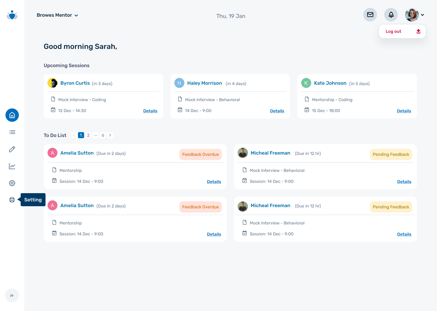
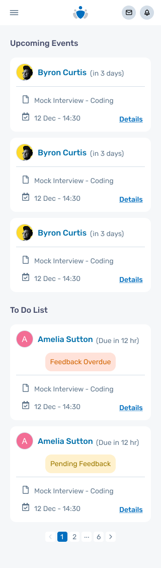
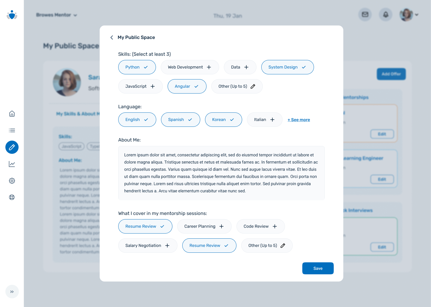
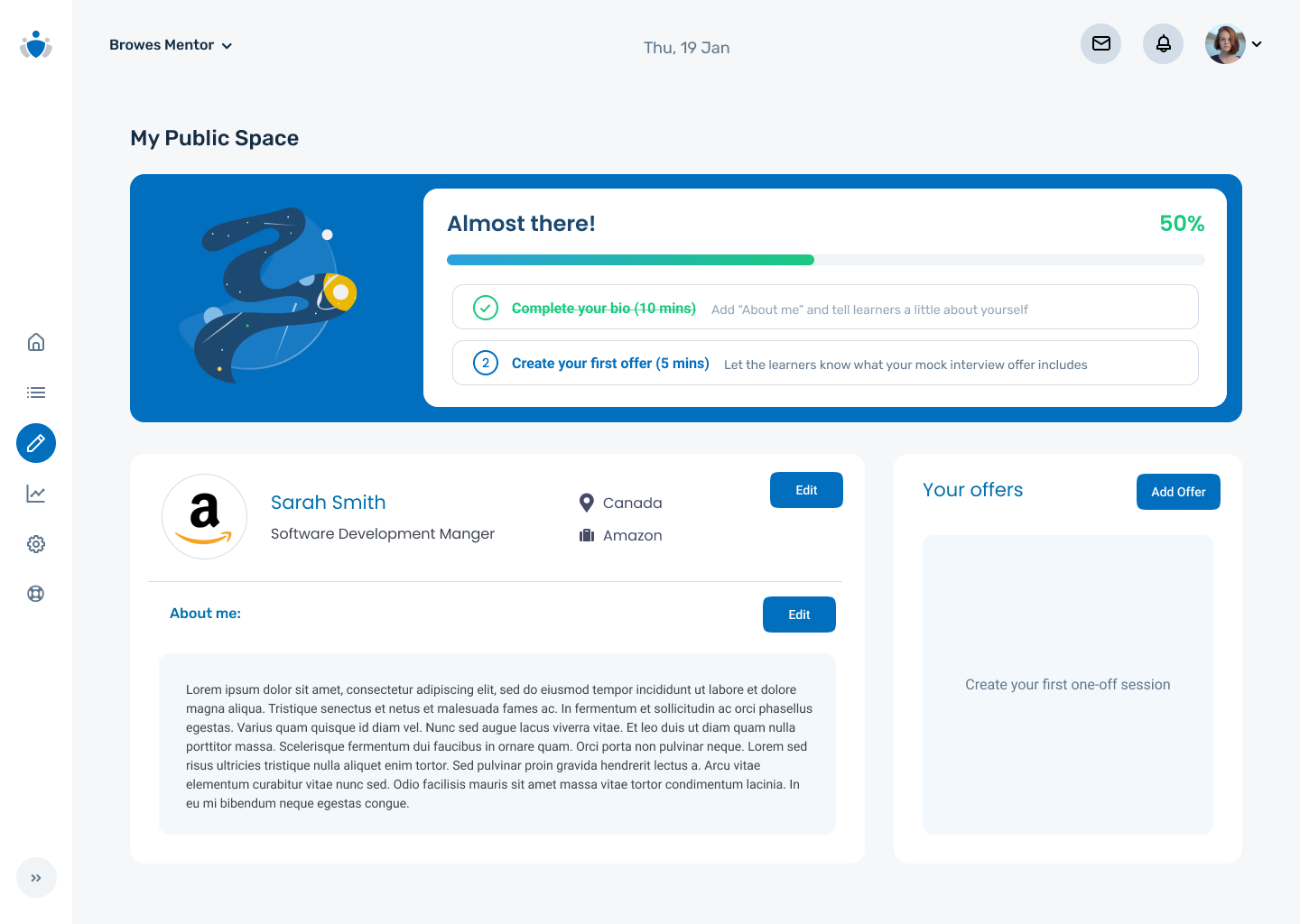
  • Building a scalable dashboard for future expansion. Selected screens are shown below.

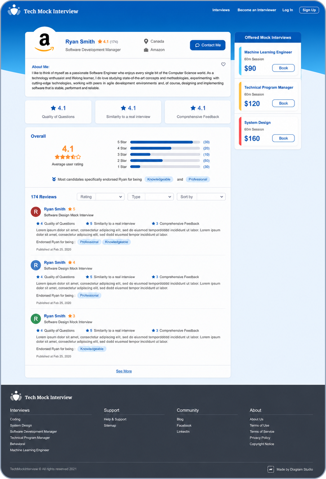
Redesigns

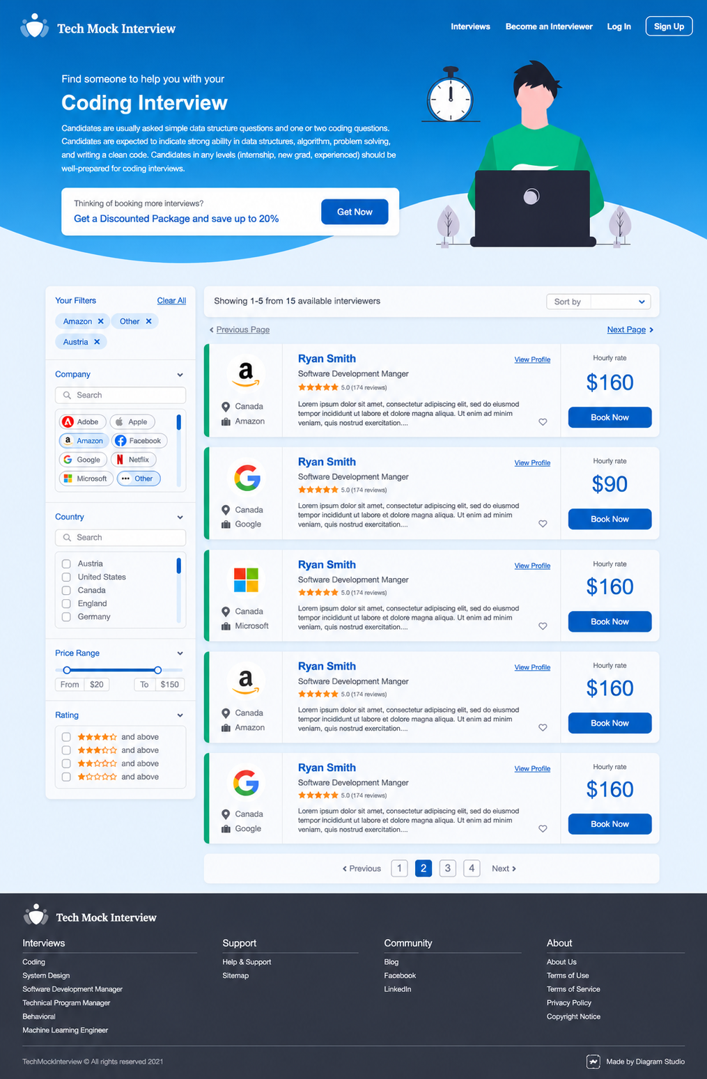
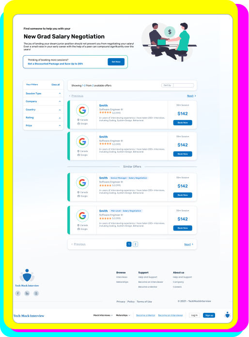
With limited technical capacity, I designed multiple staged solutions within the existing codebase and page structure, balancing UI improvements and new features with lower engineering effort and minimal disruption to current users.

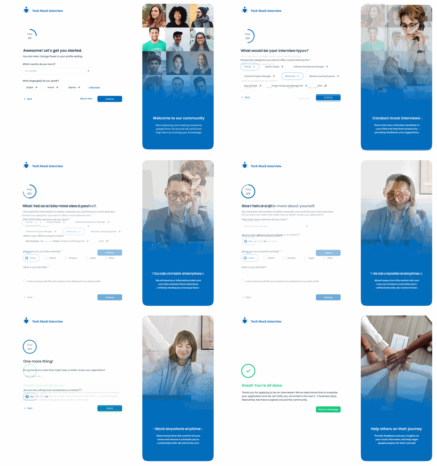
Onboarding

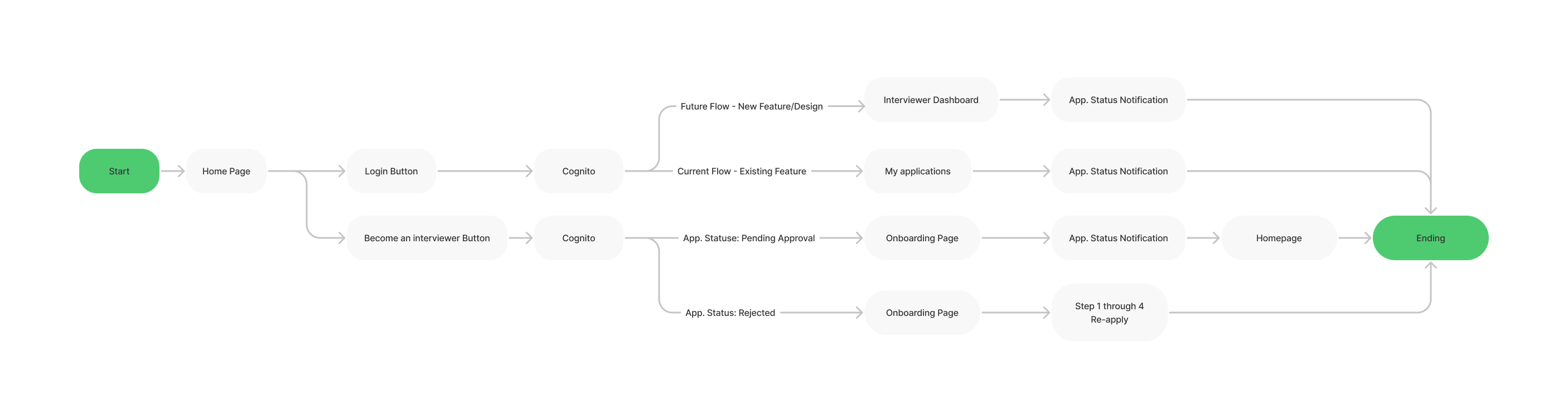
Smooth interviewer onboarding sequence

Dashboard

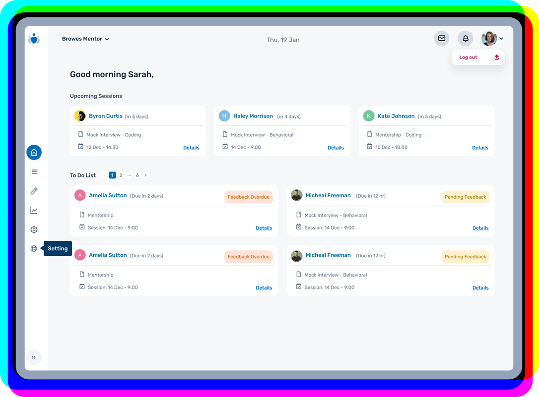
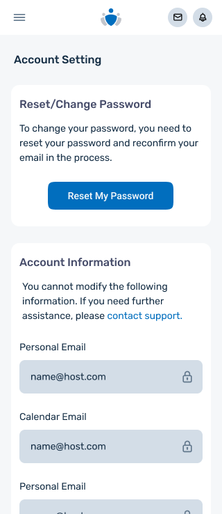
Dashboard homeDashboard mobile homeDashboard public-space editorDashboard profile setupDashboard mobile settings

Bonus!

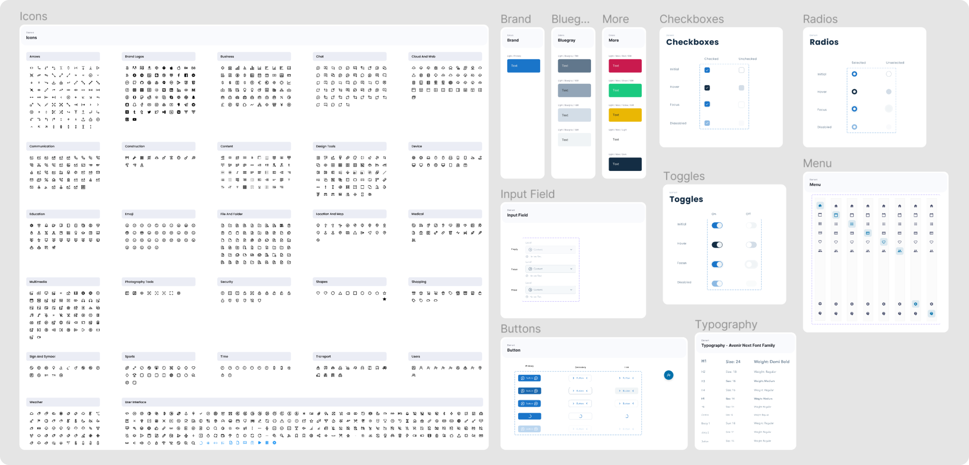
Sections of the refined design system used across the product to ensure consistency.

TechMockInterview design system

/ Impact

Helped support a major growth period → During my time on the team, drop-off decreased noticeably across key entry points and remained limited to edge cases, while the platform grew from ~1K to 10K users.

Reduced manual support demand and team effort → New onboarding, booking, and session-management flows let the product handle needs that had previously required manual support, significantly reducing recurring email requests.

Improved user satisfaction and team alignment → Stakeholders and expert users responded positively to the redesigned platform that better reflected the quality of the service. Internally, clearer design direction reduced ambiguity and improved collaboration.

/ Reflection

Better isn’t better.

Live product design changed how I think about “better.” A cleaner experience on paper can still be confusing to users who already rely on the current flow, so I learned to think more carefully about sequencing, rollout risk, and the cost of change. Sometimes new UI is not better; it is just… new.

Make the case.

A design is only as strong as the case you can make for it. (To my great disappointment,) my designs could not defend themselves in meetings! I learned to involve engineers earlier, use rapid prototypes to communicate ideas and make trade-offs visible, and better explain decisions through user value, technical effort, and business impact.

Every choice costs.

Prioritization becomes part of the craft. Working directly with multiple teams gave me a (much needed!) more realistic understanding of the actual cost of my design decisions. I learned to empathize with engineers and product teams the same way I empathize with users, then make peace with leaving good ideas behind so the team could ship what mattered most.

Prove the impact.

Good outcomes deserve better tracking. If I were doing this project again, I would define success metrics earlier and track changes more deliberately. At the time, the improvements felt obvious through user behaviour, stakeholder feedback, and reduced support requests. Unfortunately, “we could feel it working” isn’t the strongest impact metric.