

Merry Shirvani / UX Designer
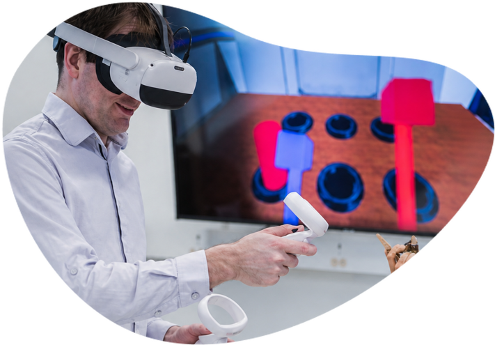
A clinician demonstrating the bWell virtual reality experience

bWell
VR Training

Evaluating and Improving a Clinical VR App to Support Home Use

  • UX Evaluation
  • Redesign
  • UX/UI
Natural Sciences and Engineering Research Council of Canada
Role
UX Designer
Time
Spring 2023
Project Type
Contract — DFP × NRC Collaboration

/ Context

In the clinic, bWell worked beautifully.

The immersive VR platform was designed by NRC’s Virtual Therapies Team to support cognitive training through interactive games. After patients showed interest in using it at home, the team developed an early self-guided version.

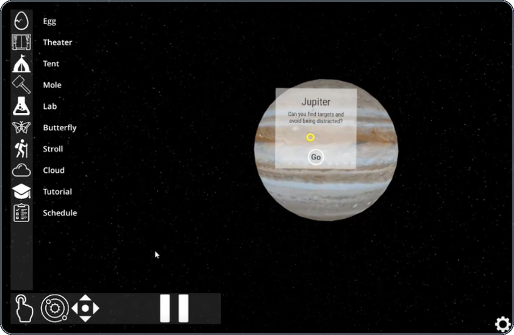
The original clinical bWell VR interface
(Clinical version)

Yet without the supervision,
small frictions quickly became real barriers.

That’s when they reached out to the University of British Columbia’s DFP industry program. I joined the team as one of two UX designers, working alongside two health researchers to help improve this early home version before wider rollout.

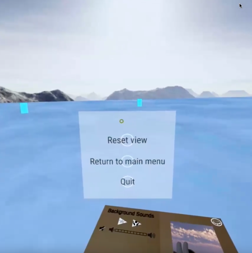
The early bWell at-home interface
(bWell at-home version)
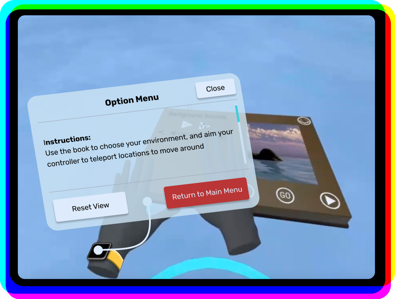
Original home interface beside the redesigned bWell experience

Redesigned

Mission

Support the product’s transition from clinical version to unsupervised home use & support long-term engagement

/ The Problem & Approach

Facing a strict deadline, the brief sounded straightforward: “Evaluate autonomous use for new users and suggest new features.” But after reviewing their research and meeting with the team, I realized the underlying concern was that outcomes and engagement didn’t match what they’d previously seen in the clinical version. This led me to approach the work...

Not as a usability checklist,
but a product transition challenge.

A more complex problem, for sure, but exactly the type of challenge I’m drawn to.

I approached the project through four stages, which form the structure of the rest of this page:

  1. 1. Discover
  2. 2. Define
  3. 3. Develop
  4. 4. Deliver

/ Discover

Methods

Cognitive walkthrough — Evaluating the core flow against existing research and autonomous-use needs.

Reviewing prior studies — Understanding clinical support, target users, and known usability concerns.

Usability testing — Observing first-time users working through representative tasks.

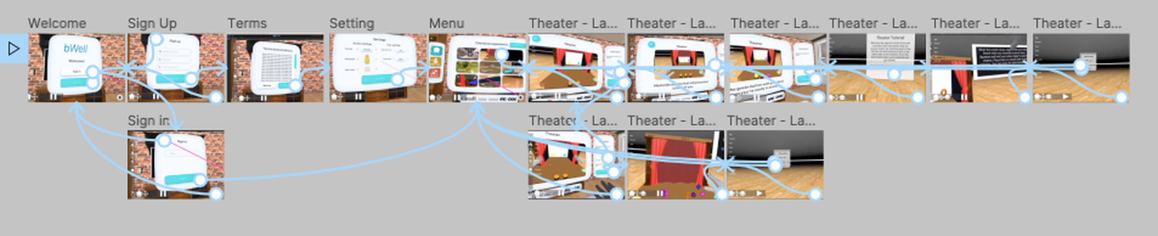
A glimpse of the 2D prototype used in place of the VR experience
(A glimpse into the process: 2D prototype used in lieu of a VR experience)
Insights

Recovery was hard without the clinician’s invisible support.

In the clinic, a clinician could explain the flow, reassure users, and help them recover from confusion in real time. At home, those recovery moments had to be handled by the product, but the interface did not yet provide enough guidance or reassurance.

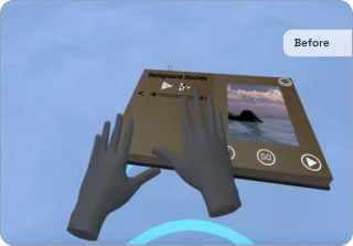
Small VR frictions became bigger barriers for new users.

Many expected users were new to VR, and the lack of familiar keyboard-and-mouse patterns made navigation, discoverability, and control feedback more important. With so many small inconveniences, users had lower confidence exploring or correcting mistakes on their own.

Retention could not depend on the novelty of the games alone.

The games carried the therapeutic value, but repeated home use needed support around the experience: clearer progress, motivation, and return cues to help users stay engaged without a clinician encouraging them.

/ Define

With a fixed timeline and the client’s need for evaluation insights, we focused on deliverables that could guide NRC’s next product iteration rather than attempting a full redesign. We organized the work into three recommendation layers, each tied to a different level of product maturity:

What is
broken?

Understand existing usability issues, interaction failures, and how severely they affected autonomous use.

What can be
better?

Improve high-friction flows, including onboarding and navigation, to better match the skill level of first-time VR users.

What comes
after?

Define future opportunities to support long-term use and sustained motivation, informed by engagement theory.

/ Develop

A large part of the design work was making the findings and recommendations usable for NRC. As a team, we translated our data into severity maps that considered usability issues, overlooked cognitive load, and the realities of autonomous home use.

Beyond this, my role also focused on the UX translation layer: identifying key interaction breakdowns, exploring redesign directions, and turning recommendations into visual concepts. I focused on VR-friendly metaphors anchored in real-world objects and experiences, while synthesizing engagement strategies relevant to therapeutic contexts.

/ Deliver

The final deliverable was a structured evaluation report, supported by medium-fidelity prototypes and recommendations organized into the layers defined earlier. A selection of outputs is presented below.

What to prioritize →
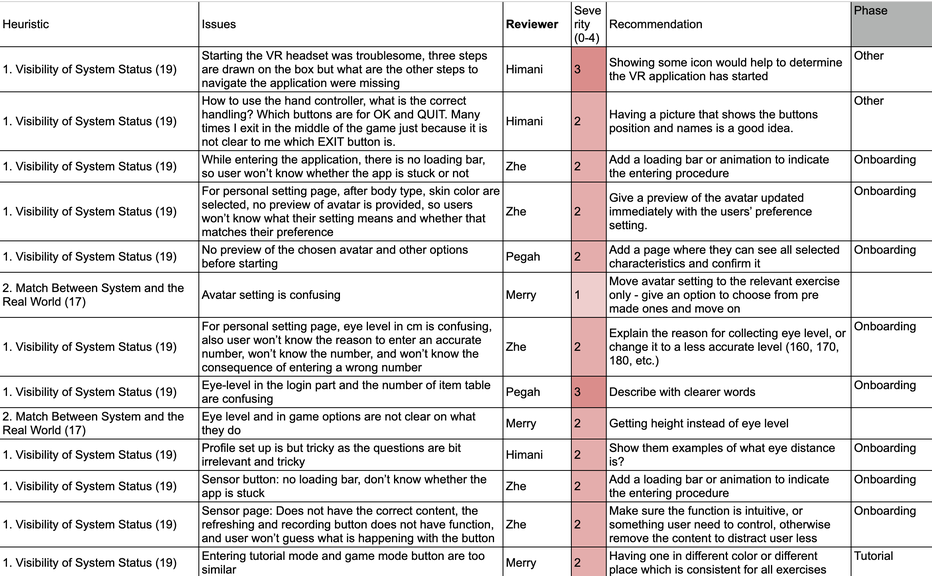
Comprehensive summary of critical usability and interaction failures, prioritized by severity.

What to improve →
Redesign proposals for the interactions users struggled with most, including onboarding and in-app flow improvements.

What’s next →
Evidence-based recommendations for long-term engagement to help users return, progress, and stay motivated without clinician support.

Intuitive Navigation

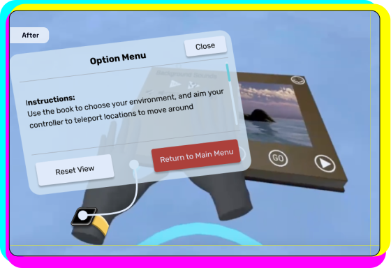
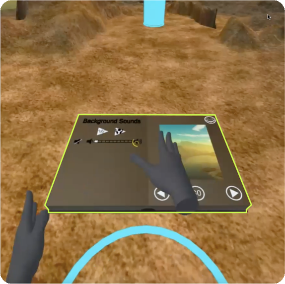
Using a familiar real-world metaphor, I anchored hidden controls to a virtual wristwatch to address navigation challenges, making recovery intuitive and consistent across all games.

The original navigation interface
Redesigned navigation using a virtual wristwatch

Better Accessibility

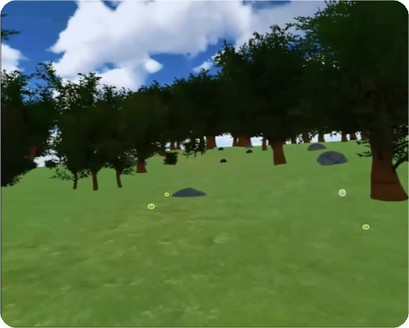
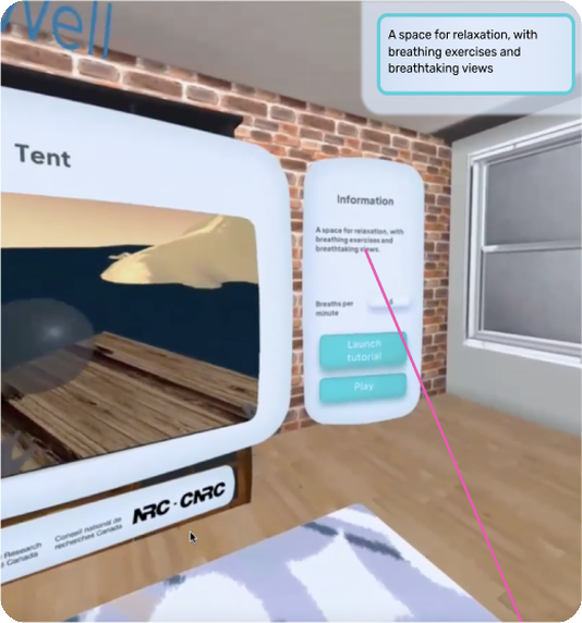
I utilized sufficient contrast, optional text overlays, and highlighted interactive elements to support first-time VR users and diverse visual needs without treating accessibility as an edge case.

Interactive elements highlighted with sufficient contrast Optional markers in a virtual landscape Optional text overlays in the bWell interface

Clear Layout

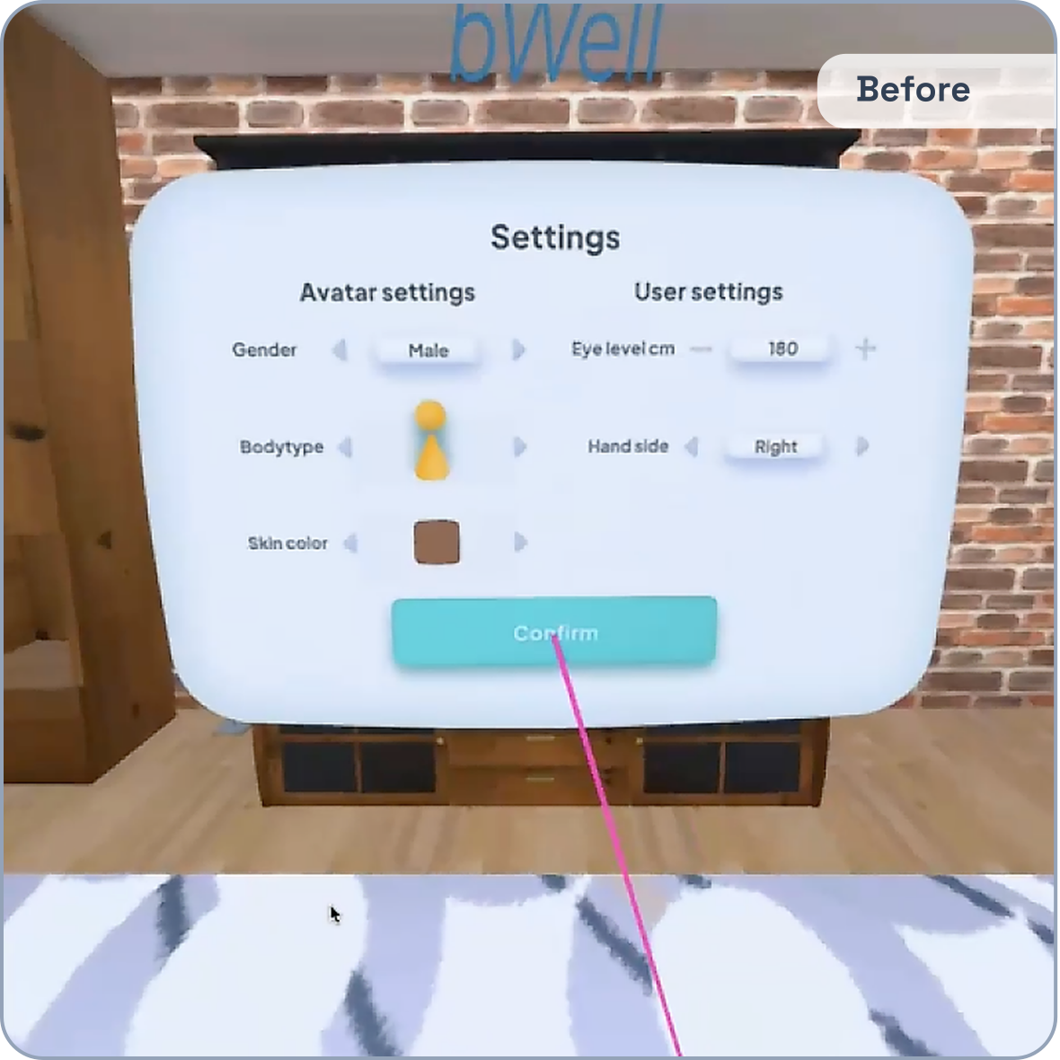
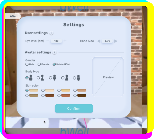
For a user base largely new to VR, I prioritized interaction patterns familiar from everyday apps and replaced click-through settings with a clearer, scannable layout that surfaced all options at a glance.

The original click-through settings interface
Redesigned settings with all options visible

Usability Reports

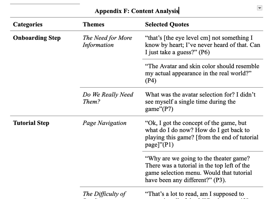
Content analysis from the bWell usability report Prioritized heuristic findings and recommendations

/ Impact

Exceeded stakeholder expectations →Despite access delays and a fixed timeline, stakeholders were highly satisfied that we delivered the requested evaluation and went beyond scope with root-cause insights, redesign concepts, and clear next steps.

Informed subsequent research →While post-implementation outcomes remain confidential, our recommendation for theory-based gamification as an engagement strategy became a major focus of NRC’s subsequent published research.

/ Reflection

Bug Turned Feature.

Constraints can become opportunities. With a fixed timeline and delayed access to the headset, waiting would have been easy to justify... tempting, even! Instead, we improvised with screenshot walkthroughs, parallel prep work, and engagement research before VR testing began. The “backup plan” ended up making the final evaluation stronger, not just possible.

Same user,
different medium.

Design skill transfers across medium. This was my first VR project, so I was excited and mildly terrified. But it reminded me that the medium is rarely the whole problem; the interaction around it is. At its core, the experience was still about humans feeling frustrated, confused, and under-supported. Same fears, same design principles, just with a fancier headset.

The art of
being curious.

Don’t just solve the problem given; find out what the question is. ... I think it was Don Norman who said it's easy to solve the wrong problem. And, well, you never know what you’ve missed unless you go looking. This work made me realize that design’s real impact comes from looking beyond what feels urgent. Getting to the root of stakeholder’s concerns shifted our mindset toward the underlying challenge of product transition, which was the breakthrough that made our recommendations more strategic than the requested checklist of interface fixes.

Design is
a team sport.

I would bring the clinical context closer. Working within a multidisciplinary team made me appreciate, more than ever, the different perspectives each person brings to the table. If I were doing this again, I’d involve more clinicians and users familiar with the earlier supervised version, despite the (much dreaded) ethical approval process. Those users held knowledge that design skills alone could not replace: what made the games therapeutically valuable and which support moments the home version had to preserve.